


Most well-designed websites and apps have a custom-designed icon library that helps them to create icons in any color, variation, and consistency that retains throughout the whole project. Let's create a similar but smaller custom icon library.
Why a custom Icon library?
There are libraries like FontAwesome and Material UI to make our life easier but there are cons to using them too.
These libraries when imported provide tons of icons including those which we never use.
When your team decides to use customized icons, a Custom Icon Library is preferred.
Custom Icon Libraries are highly reusable and reduce the bundle size.
Basic structure of a Custom Icon Library
Using SVG is a better choice for icons as they are highly scalable, interactive, and SEO friendly and all of these benefits come with compact file size.
We need a basic idea of some of the elements and attributes of the SVG. Let's have a look at how an SVG icon looks like in the editor. For example, here is a material Icon.
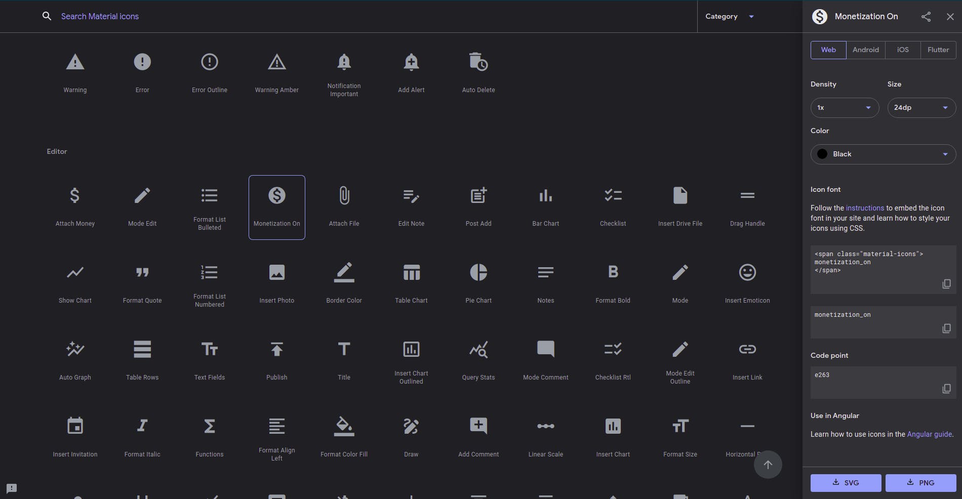
Download it as SVG and open it up in a text editor. The SVG file looks something like this:
<svg xmlns="http://www.w3.org/2000/svg" height="24px" viewBox="0 0 24 24" width="24px" fill="#000000">
    <path d="M0 0h24v24H0z" fill="none"/><path d="M12 2C6.48 2 2 6.48 2 12s4.48 10 10 10 10-4.48 10-10S17.52 2 12 2zm1.41 16.09V20h-2.67v-1.93c-1.71-.36-3.16-1.46-3.27-3.4h1.96c.1 1.05.82 1.87 2.65 1.87 1.96 0 2.4-.98 2.4-1.59 0-.83-.44-1.61-2.67-2.14-2.48-.6-4.18-1.62-4.18-3.67 0-1.72 1.39-2.84 3.11-3.21V4h2.67v1.95c1.86.45 2.79 1.86 2.85 3.39H14.3c-.05-1.11-.64-1.87-2.22-1.87-1.5 0-2.4.68-2.4 1.64 0 .84.65 1.39 2.67 1.91s4.18 1.39 4.18 3.91c-.01 1.83-1.38 2.83-3.12 3.16z"/>
</svg>
svg: It is the root element of an SVG icon. The whole icon wraps into it.heightandwidthdetermines the size of the icon.viewBoxattribute takes values as a list of four numbers:min-x,min-y,widthandheight.fillsets the color of the SVG.pathdefines the shape of the icon. There can be many paths and shapes wrapped within thesvgelement.
After viewing some of the icons in the editor, you can observe that everything except the d attribute of path remains the same. The basic idea is to create a react component that takes value for d as a prop and returns the SVG code of the icon we need.
This way we can use this component to create an icon corresponding to every d value we store.
Writing the Icon Library from scratch
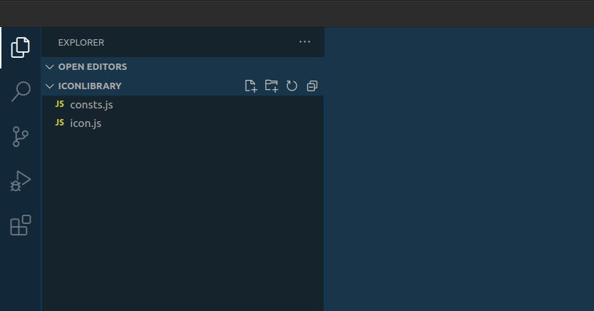
We need a directory(folder) for the Icon library. Let's create a directory (folder) named iconLibrary in a text editor. Remember, we don't yet need a react project to do this. We'll come to the implementation part once our library is created.
Create two javascript files within iconLibrary named consts.js and icon.js.
consts.js will store and export the d values of all the icons that we need in our project. Let's put some code into it.
export const ICONS = {
  FACEBOOK:
    "M608 192h160v-192h-160c-123.514 0-224 100.486-224 224v96h-128v192h128v512h192v-512h160l32-192h-192v-96c0-17.346 14.654-32 32-32z",
  LINKEDIN:
    "M928 0h-832c-52.8 0-96 43.2-96 96v832c0 52.8 43.2 96 96 96h832c52.8 0 96-43.2 96-96v-832c0-52.8-43.2-96-96-96zM384 832h-128v-448h128v448zM320 320c-35.4 0-64-28.6-64-64s28.6-64 64-64c35.4 0 64 28.6 64 64s-28.6 64-64 64zM832 832h-128v-256c0-35.4-28.6-64-64-64s-64 28.6-64 64v256h-128v-448h128v79.4c26.4-36.2 66.8-79.4 112-79.4 79.6 0 144 71.6 144 160v288z",
  TWITTER:
    "M1024 226.4c-37.6 16.8-78.2 28-120.6 33 43.4-26 76.6-67.2 92.4-116.2-40.6 24-85.6 41.6-133.4 51-38.4-40.8-93-66.2-153.4-66.2-116 0-210 94-210 210 0 16.4 1.8 32.4 5.4 47.8-174.6-8.8-329.4-92.4-433-219.6-18 31-28.4 67.2-28.4 105.6 0 72.8 37 137.2 93.4 174.8-34.4-1-66.8-10.6-95.2-26.2 0 0.8 0 1.8 0 2.6 0 101.8 72.4 186.8 168.6 206-17.6 4.8-36.2 7.4-55.4 7.4-13.6 0-26.6-1.4-39.6-3.8 26.8 83.4 104.4 144.2 196.2 146-72 56.4-162.4 90-261 90-17 0-33.6-1-50.2-3 93.2 59.8 203.6 94.4 322.2 94.4 386.4 0 597.8-320.2 597.8-597.8 0-9.2-0.2-18.2-0.6-27.2 41-29.4 76.6-66.4 104.8-108.6z",
  GITHUB:
    "M512.008 12.642c-282.738 0-512.008 229.218-512.008 511.998 0 226.214 146.704 418.132 350.136 485.836 25.586 4.738 34.992-11.11 34.992-24.632 0-12.204-0.48-52.542-0.696-95.324-142.448 30.976-172.504-60.41-172.504-60.41-23.282-59.176-56.848-74.916-56.848-74.916-46.452-31.778 3.51-31.124 3.51-31.124 51.4 3.61 78.476 52.766 78.476 52.766 45.672 78.27 119.776 55.64 149.004 42.558 4.588-33.086 17.852-55.68 32.506-68.464-113.73-12.942-233.276-56.85-233.276-253.032 0-55.898 20.004-101.574 52.76-137.428-5.316-12.9-22.854-64.972 4.952-135.5 0 0 43.006-13.752 140.84 52.49 40.836-11.348 84.636-17.036 128.154-17.234 43.502 0.198 87.336 5.886 128.256 17.234 97.734-66.244 140.656-52.49 140.656-52.49 27.872 70.528 10.35 122.6 5.036 135.5 32.82 35.856 52.694 81.532 52.694 137.428 0 196.654-119.778 239.95-233.79 252.624 18.364 15.89 34.724 47.046 34.724 94.812 0 68.508-0.596 123.644-0.596 140.508 0 13.628 9.222 29.594 35.172 24.566 203.322-67.776 349.842-259.626 349.842-485.768 0-282.78-229.234-511.998-511.992-511.998z",
  INSTAGRAM:
    "M512 92.2c136.8 0 153 0.6 206.8 3 50 2.2 77 10.6 95 17.6 23.8 9.2 41 20.4 58.8 38.2 18 18 29 35 38.4 58.8 7 18 15.4 45.2 17.6 95 2.4 54 3 70.2 3 206.8s-0.6 153-3 206.8c-2.2 50-10.6 77-17.6 95-9.2 23.8-20.4 41-38.2 58.8-18 18-35 29-58.8 38.4-18 7-45.2 15.4-95 17.6-54 2.4-70.2 3-206.8 3s-153-0.6-206.8-3c-50-2.2-77-10.6-95-17.6-23.8-9.2-41-20.4-58.8-38.2-18-18-29-35-38.4-58.8-7-18-15.4-45.2-17.6-95-2.4-54-3-70.2-3-206.8s0.6-153 3-206.8c2.2-50 10.6-77 17.6-95 9.2-23.8 20.4-41 38.2-58.8 18-18 35-29 58.8-38.4 18-7 45.2-15.4 95-17.6 53.8-2.4 70-3 206.8-3zM512 0c-139 0-156.4 0.6-211 3-54.4 2.4-91.8 11.2-124.2 23.8-33.8 13.2-62.4 30.6-90.8 59.2-28.6 28.4-46 57-59.2 90.6-12.6 32.6-21.4 69.8-23.8 124.2-2.4 54.8-3 72.2-3 211.2s0.6 156.4 3 211c2.4 54.4 11.2 91.8 23.8 124.2 13.2 33.8 30.6 62.4 59.2 90.8 28.4 28.4 57 46 90.6 59 32.6 12.6 69.8 21.4 124.2 23.8 54.6 2.4 72 3 211 3s156.4-0.6 211-3c54.4-2.4 91.8-11.2 124.2-23.8 33.6-13 62.2-30.6 90.6-59s46-57 59-90.6c12.6-32.6 21.4-69.8 23.8-124.2 2.4-54.6 3-72 3-211s-0.6-156.4-3-211c-2.4-54.4-11.2-91.8-23.8-124.2-12.6-34-30-62.6-58.6-91-28.4-28.4-57-46-90.6-59-32.6-12.6-69.8-21.4-124.2-23.8-54.8-2.6-72.2-3.2-211.2-3.2v0z",
  VSCODE:
    "M987.733 110.379l-210.773-101.419c-8.085-3.983-17.599-6.313-27.657-6.313-17.61 0-33.553 7.141-45.089 18.685v0l-403.627 368.213-175.787-133.461c-7.069-5.407-16.034-8.664-25.759-8.664-11.063 0-21.141 4.215-28.717 11.126l-56.372 51.255c-8.595 7.834-13.967 19.075-13.967 31.571 0 12.476 5.355 23.701 13.891 31.503l0.033 0.030 152.448 139.093-152.448 139.093c-8.569 7.831-13.924 19.057-13.924 31.533 0 12.496 5.372 23.738 13.933 31.541l0.034 0.030 56.448 51.243c7.543 6.881 17.621 11.096 28.684 11.096 9.725 0 18.689-3.257 25.861-8.739l-0.103 0.075 175.787-133.461 403.627 368.213c11.524 11.547 27.457 18.69 45.058 18.69 10.055 0 19.565-2.331 28.021-6.483l-0.375 0.166 210.859-101.419c21.585-10.592 36.181-32.41 36.181-57.638 0-0.017 0-0.033 0-0.050v0.003-687.829c0-0.002 0-0.004 0-0.006 0-25.261-14.635-47.104-35.889-57.512l-0.378-0.167zM768.171 744.448l-306.261-232.448 306.261-232.448z",
};
These are the d values of some social icons stored as properties in a javascript object named ICONS.
Now the second and final part is to write the react component to render the icons.
import React from "react";
import { ICONS } from "./consts"; //importing d values from consts.js

const Icon = ({ icon, color, size, className }) => (
  // arrow function to return the svg icon.
  <svg
    width={size}
    height={size}
    fill={color}
    className={className}
    viewBox="0 0 1024 1024"
  >
    <path d={ICONS[icon]}></path>
  </svg>
);

// default properties for icons
Icon.defaultProps = {
  color: "black",
  size: "25",
  className: "icon",
};

export default Icon; // exporting the icon
Let's understand how this component renders the icon.
On line 2, we are importing the ICONS object from
consts.js.The const
Iconreturns the SVG element after embedding thedvalue.defaultPropsdetermines the default look and feel of the icon.And finally we export the
Icon
Congratulations, Our Icon Library is ready to use. Leave a comment saying successfully created the library if you are following it.
Let's use create a react project to use this library. You can skip the setup process if you can create a React project on your own.
Setting up the environment
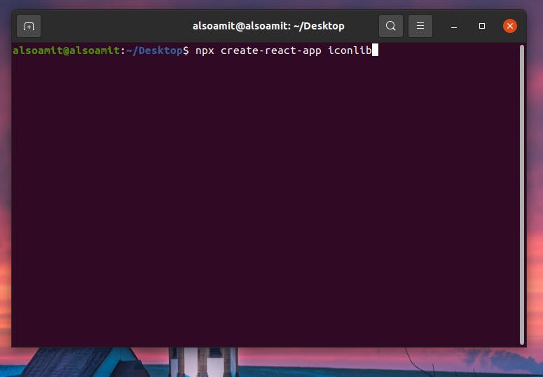
Let us start with creating a React project. Follow the steps below if you have node and npx installed in your machine.
- Open the terminal in a directory( Desktop in my case ). Run the command
npx create-react-app iconlib. You can name it whatever you want. After 10 minutes of head-scratching, I decided to keep it iconlib. The installation will take a couple of minutes. Wait patiently!
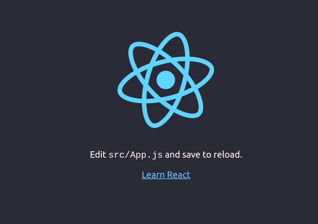
- This screen appears (see below) after the process is completed.

- Now run the command
cd iconlib. And finally,
npm start.The browser should open to show the default React website by now.
Cleaning up the environment
React project comes with a lot of boilerplate code. Let's clean it up for simplicity. Here is the modified folder structure. Make sure you have the same although it is not important.
This is our modified public/index.html. We won't touch it anymore.
<!DOCTYPE html>
<html lang="en">
  <head>
    <meta name="viewport" content="width=device-width, initial-scale=1" />
    <title>Custom Icon Library</title>
  </head>
  <body>
    <noscript>You need to enable JavaScript to run this app.</noscript>
    <div id="root"></div>
  </body>
</html>
This is the modified and cleaned src/index.js.
import React from "react";
import ReactDOM from "react-dom";
import "./index.css";
import App from "./App";

ReactDOM.render(
  <App />,
  document.getElementById("root")
);
And here goes the src/App.js
function App() {
  return (
    <div className="App">
      <h1>Hello Hackers!</h1>
    </div>
  );
}

export default App;
Using the Icon Library
We have created both the library and the project but the library needs to be inside of the project folder. Bring the whole iconLibrary directory inside the src directory of the React project.
Now since the icon.js exports the Icon component, we can import this component in our App.js and the icon will show up in the browser.
Edit the src/App.js to use the Icon component.
import Icon from "./iconLibrary/icon";

function App() {
  return (
    <div className="App">
      <h1>Using our Personal Icon Library</h1>
      <Icon icon="TWITTER" color="black" size="40" />
    </div>
  );
}

export default App;
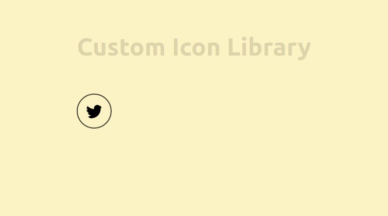
Our first icon has been rendered. Feel free to experiment with the code.
Note that I have tweaked the index.css to give it an aesthetic look.
body {
  margin: 0;
  font-family: -apple-system, BlinkMacSystemFont, "Segoe UI", "Roboto", "Oxygen",
    "Ubuntu", "Cantarell", "Fira Sans", "Droid Sans", "Helvetica Neue",
    sans-serif;
  -webkit-font-smoothing: antialiased;
  -moz-osx-font-smoothing: grayscale;
  padding: 2rem;
  display: flex;
  justify-content: center;
  align-items: center;
  background-color: rgb(255, 236, 200);
}

h1 {
  text-align: center;
  margin: 2rem;
  font-size: 3rem;
  text-align: center;
  color: rgba(0, 0, 0, 0.137);
}

.icon {
  height: 2rem;
  width: 2rem;
  margin: 2rem;
  padding: 1rem;
  border-radius: 50%;
  border: 2px solid rgba(0, 0, 0, 0.726);
}
This is what the final version looks like.
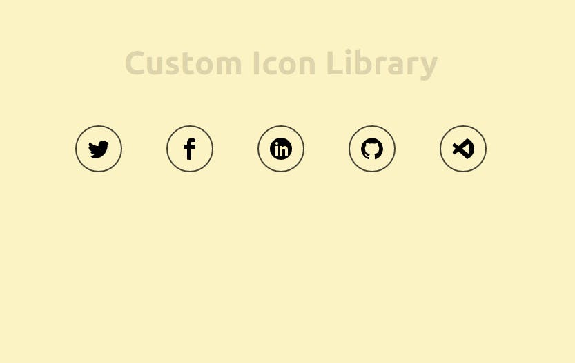
The complete src/App.js of the final version.
import Icon from "./iconLibrary/icon";

function App() {
  return (
    <div className="App">
      <h1>Custom Icon Library</h1>
      <Icon icon="TWITTER" color="black" size="40" />
      <Icon icon="FACEBOOK" color="black" size="40" />
      <Icon icon="LINKEDIN" color="black" size="40" />
      <Icon icon="GITHUB" color="black" size="40" />
      <Icon icon="VSCODE" color="black" size="40" />
    </div>
  );
}

export default App;
You can find the complete repository here on Github.
How to add more icons into the project
To add new icons, search for SVGs, inspect or download them as SVG and copy the value of d attribute from the path element and register it in the consts.js file. Some of the resources for free SVG icons are:-
Material Icon Fonts from Google Fonts.
Ask your designer to design a custom Icon Set.
Add as many icons as you need but don't use multiple resources for your icons as it breaks the consistency.
Note: Not every SVG is free for commercial use.
Final Words
We have created a scalable custom SVG Icon Library successfully. Share with us what you think about it. Connect with me on Twitter or LinkedIn to share your thoughts and problems.
Happy Coding!