

How to make visually appealing websites- 6 easy steps.
Never build an ugly website again - design fundamentals for beginners


You don't need a designer for each and every project including portfolios, projects, and blogs.
Doesn't matter how hard you've worked on a project and how awesome the project is, if it is not easy to use and appealing in design, you'll lose a lot much attention that you deserve.
We are going to explore the basics of design to present ourselves better every time. Maybe you are not so interested in design but keeping a few rules in mind will help a lot.
Why is Web Design important
First Impressions are 95% design-related.
36 percent of people stop engaging with ugly websites on the very first visit.
89 percent of visitors are less likely to return after a bad experience.
It builds trust with the visitors or job interviewers (I got you covered in case you are a student).
How to implement good design
Design can be intuitive and experience-based but it does have some fundamentals. Following the design fundamentals, you can avoid building ugly experiences. Let's do some hands-on practice on how to design an awesome-looking website.
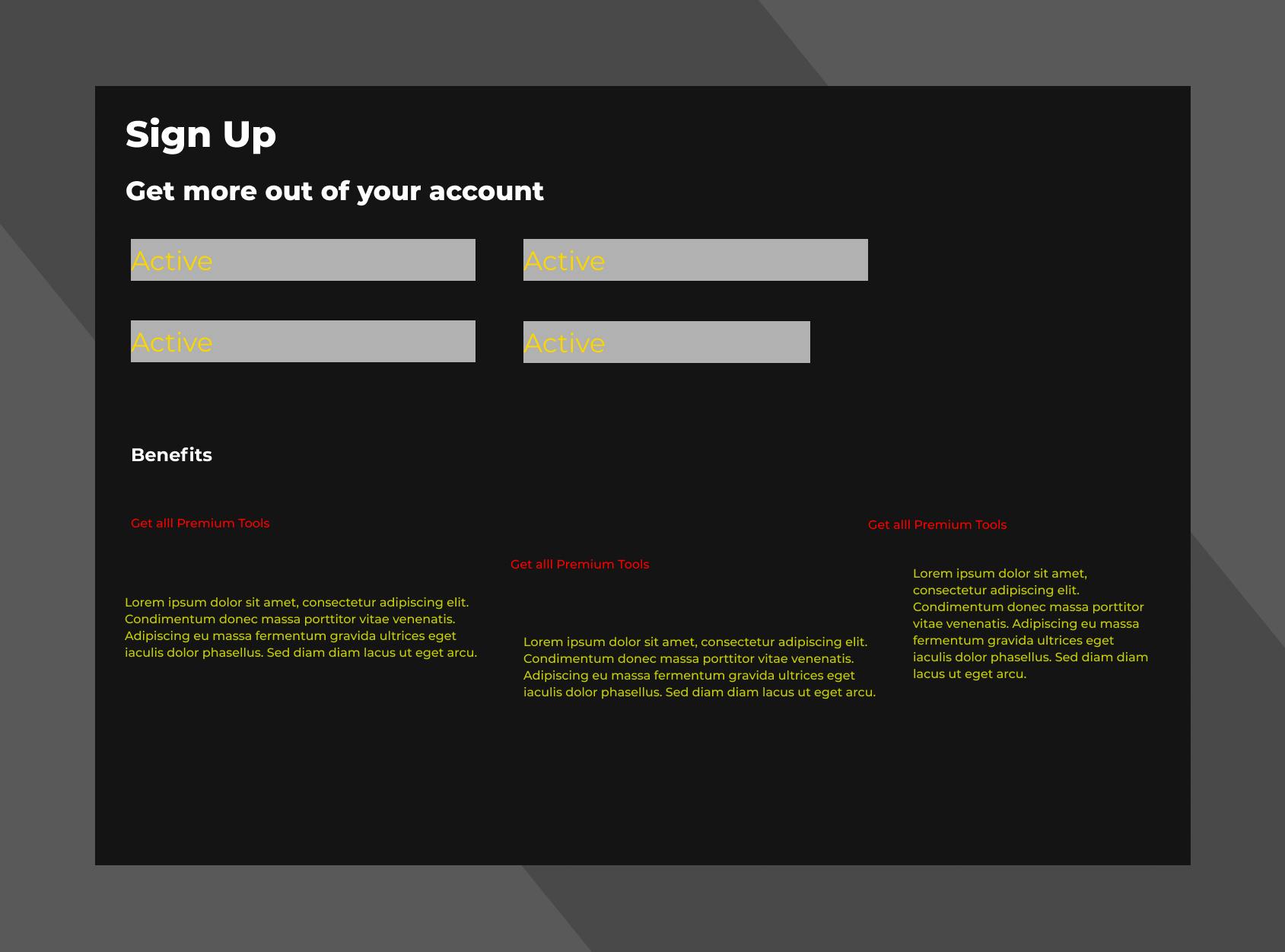
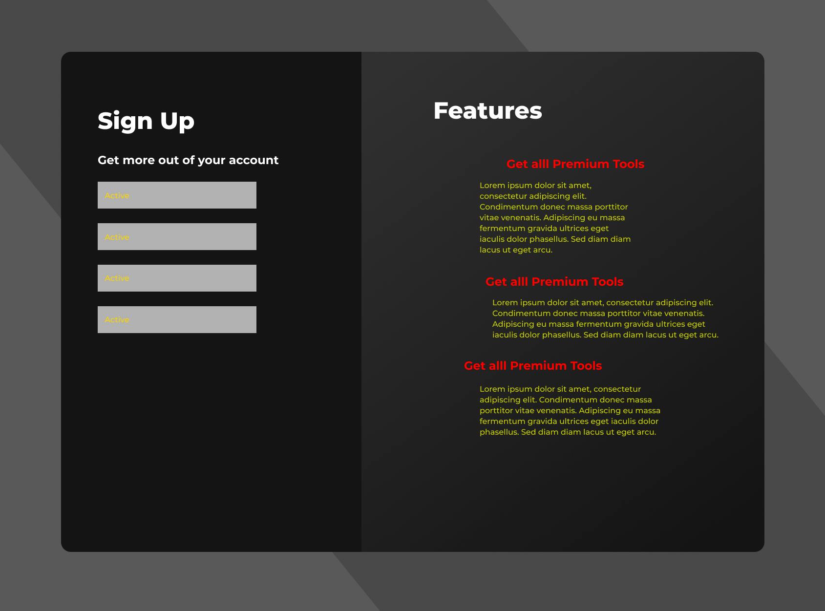
Let's start with an ugly design of a Website Form. We are going to use the design fundamentals to convert this design to make it look much better. We need nothing more than common sense.
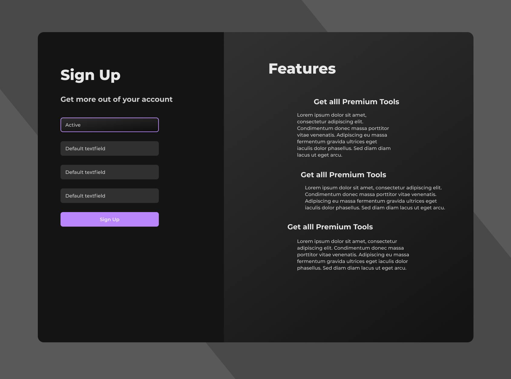
After applying all the fundamentals, the design will look something like this.

Predictable and Responsive Layout
A well-designed consistent layout makes it easy to consume and predict the information it contains. It's a fundamental part of any type of communication.
We group similar objects to make sense of the world around us. This could be grouping things of similar colour, shape, size, or the type of information.
Elements that all relate to each other must be separated from the rest of the content that doesn't relate.
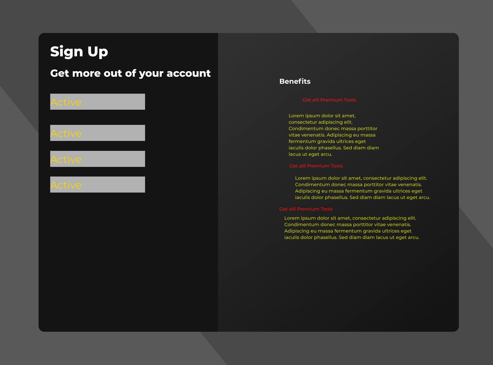
In the above image, you can easily observe the difference. The Sign-Up form doesn't relate directly to the Benefits section. So it is better to separate them in their own respective columns.
Create Visual Hierarchy
People don't read pages, they scan them. It gets highly confusing when everything looks equally important. Visual hierarchy is a way of arranging elements to show their order of importance or relation with other elements, thus organizing and prioritizing the content.
The most important things should be larger and bolder with enough whitespace around them.
Related things should be grouped using the same visual style, color, or size.
Break up the content into clearly defined areas.
In the initial design, all the text elements were almost the same size. This drives pain in the blood of the readers as they have to find meaningful and useful content on their own.
But, the modified design eases the process of highlighting the important things using larger and bolder text. This draws the immediate attention of the reader to the most important contents only.
Whitespace
White space is the area between design elements or the space between two adjacent lines of text. This is a tool to organize the design by putting the elements at appropriate positions with enough space around them.
- Maintain enough amount of white space between the borders and the content.
- Keep enough line-height between the lines of the paragraphs (160% is recommended).
- Equal amount of whitespace between visually similar elements.
In the above design, enough whitespace is maintained between the borders and the Sign-Up section. Also, all the input boxes of the form section are separated by an equal amount of whitespace.
Color and Contrast
A very important part of the design is how you use colours. People decide whether or not they like a product in 90 seconds or less and 90% of that decision is based solely on colour.
Avoid using more than 3 colours if you don't know how to handle them ( a very common issue among non-designers).
Not every colour works harmoniously with others. For example, the yellow text colour in our initial design looks extremely ugly.
Don't use extremely bright colors for text elements ( they are harsh on the eyes ).
Alpha Transparency plays an important role. Try using transparent colors for texts. For example, the primary text in our modified design is
rgba(255, 255, 255, 0.8)which basically is 20% transparent white.Secondary text elements are 40% transparent white. This helps in maintaining contrast and the importance of larger texts.
Alignment
A design with poor alignment is a little like a poorly organized desk. Cluttered content can be frustrating and hard to read. Alignment helps us to arrange elements in a way that matches how people naturally scan the page. It also creates a visual connection between related elements.
Alignment is all about organizing elements relative to a line or margin. The line can be both visible or imaginary. Generally, there are three types of alignments: left, center, and right.
Center-aligned text blocks are hard to read. Use left-aligned texts most of the time.
As a general rule, if you use center alignment, make sure it’s clear that you’re using it intentionally.
Consistency in Design
Consistency in design is about making elements uniform — having them look and behave the same way. People can learn new things quickly without pain if the UI is consistent. Imagine, if Facebook changes its layout every day, it would be very painful to access even the basic features.
Fonts, sizes, buttons, labeling, and similar elements need to be consistent across the whole design to keep visual consistency.
Similar controls should function the same way to increase predictability.
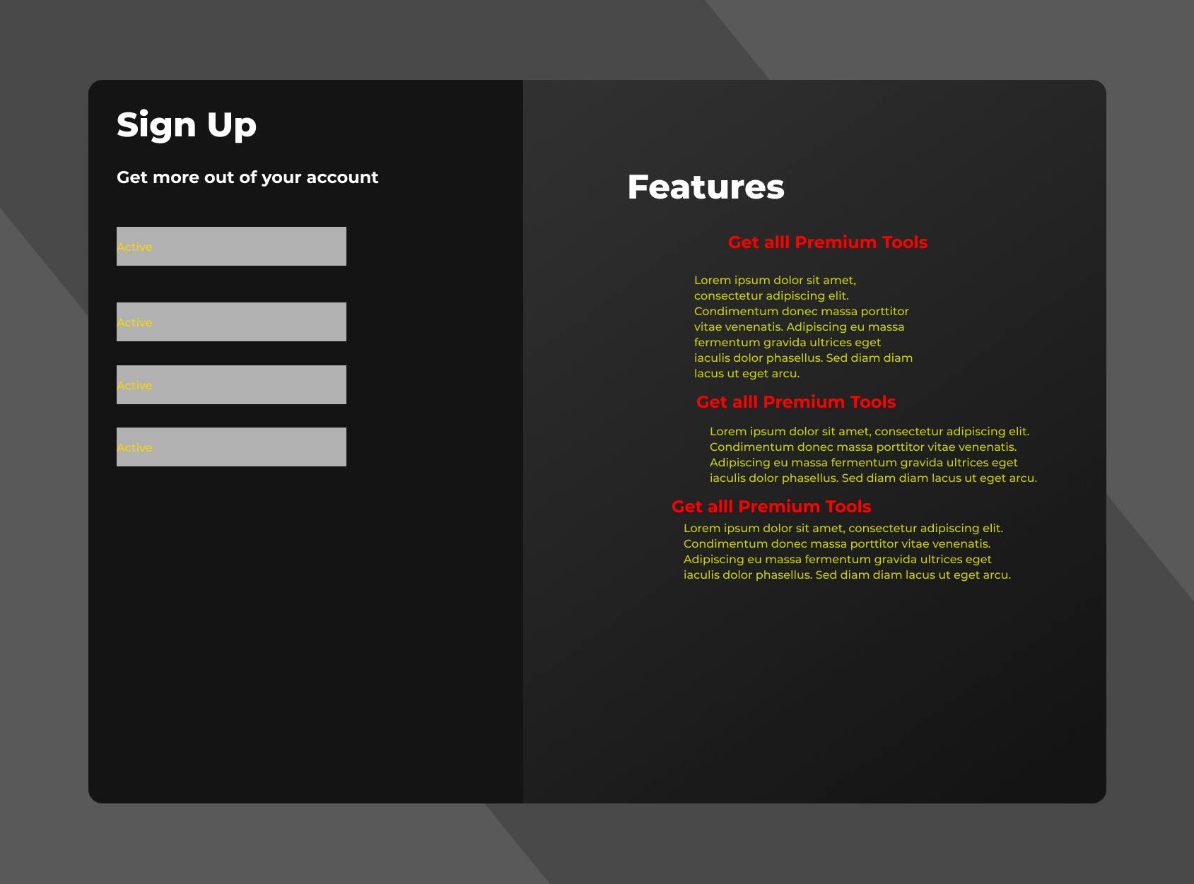
This is the final version of our design. In our initial design, the paragraphs were not consistent in size. Although this doesn't explain the whole story of consistency, it helps the design a lot in our case. Consistency is not limited to size or scale. It can be applied to colours, interactivity, and functionality of the product or a design in general.
Extra Tips
It is silly to make things overcrowded. While overcrowding, we think people can access more information in less space but the exact opposite happens (they get confused and the reputation of the product declines).
Always use a CTA (Call To Action or Business Button) button on your website or app.
Navigation should be proper and self-descriptive.
Keep it simple but consistent.
People don't read the whole story. It is important to optimize the hierarchy of the content.
A layout should always be intuitive, predictable, and responsive.
Don't use ugly fonts. Most of the times you just need a Sans-serif font for you design. Just make sure everything is readable.
Final Words
It's okay to design ugly website components as a beginner but as you progress as a designer, you need more practice of these fundamentals. You just need to dig in and get designing following tutorials and blogposts. Just believe in learning by doing.
If you’ve got questions or suggestions, post them in the comments below. We're here to help. Feel free to connect with me on Twitter or LinkedIn to share your thoughts and problems.
Happy Coding!